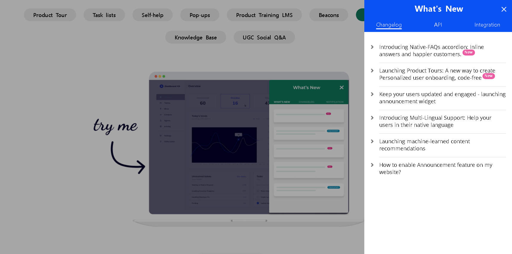
Here are some tips with examples to writing engaging announcement posts::
Title of the Announcement
Think of your title as the headline of a news article. It’s the first thing your users see, and it’s your chance to grab their attention. So, make it catchy! For example, instead of “New Feature”, try something like “Experience Lightning Fast Speeds with Our Latest Update!”.
The title should also give a clear idea of what the announcement is about. If you’re launching a new feature, make sure that’s evident in the title.
Using Tag Names
Tags help categorize and organize your content. They can be used to bring up specific content in your announcement.
Use specific and descriptive tags. Avoid generic tags that could apply to many things. The more specific your tags, the easier it will be for your content to be found.
For instance, if your announcement is about a new ‘Dark Mode’ feature, you could use tags like ‘DarkMode’, ‘NewFeature’, etc.
Playing with Colors
Colors are more than just aesthetics. They can set the mood for your announcement. Choose colors that match your brand or the theme of your announcement.
But remember, readability is most important. So, ensure there’s enough contrast between the background and text. For example, if you’re using a dark background, use light-colored text.
Also, consider the psychological impact of colors. For example, red can signify importance while blue can convey trust.
Adding Suffixes/Badges
Suffixes or badges are like little flags that grab attention. Use them to indicate a new launch or to make your announcement more noticeable.
But remember, less is more. Too many badges can make your announcement look cluttered. So, use them sparingly.
Placing Badges on Multiple Items
If you have several important points in your announcement, placing badges next to each of them can draw attention.
But be strategic about where you place your badges. They should highlight the most important information without distracting from the main content.
Organizing with Multiple Columns/Tabs
If your announcement has a lot of information, breaking it down into multiple columns or tabs can make it easier to digest.
Each tab should contain related information. For example, you could have one tab for ‘Features’, another for ‘How to Use’, etc.
But avoid having too many tabs as it can overwhelm the user.
Here's a great example of Announcement Center:
